Echoes
Bringing art to life through rich audio stories and AR-enhanced exploration
Role
Sole Product Designer
Timeline
Spring 2025 (10 week sprint)
Team
1 Designer
Class Project
Skills Leveraged
Product Design
Product Strategy
UX Research
Project Overview
This project began as a theoretical design challenge in my Digital Humanities course at UCLA, where I was tasked with creating an app concept that merges technology and cultural experiences. Over the course of the assignment, I developed Echoes from a rough idea to a high-fidelity prototype, complete with research-backed user flows, a robust color palette, and thoughtful interaction design.
INTERVIEWING USERS
Defining and validating the problem space with our users
My initial concept was inspired by the observation that many museum experiences can feel static and overwhelming, with an overload of text and little interactivity. I wanted to design an app that would transform the museum visit into an active, personal journey. My proposal focused on using AR to reveal hidden stories and auditory experiences that would resonate emotionally with visitors, turning every object into an opportunity for discovery.
Not engaging once you leave
Dense walls of text
Lack of storytelling
I created a semi-structured interview guide that emphasized the challenges people face in museums and the opportunities for mobile technology to bridge that gap. I interviewed three participants—college students and young professionals who frequent cultural sites. Key findings were that most users want more dynamic, engaging museum experiences but feel overwhelmed by dense text and a lack of clear storytelling. These insights became the foundation for the design principles of Echoes: clarity, simplicity, and an invitation to explore.
II. USER PERSONA
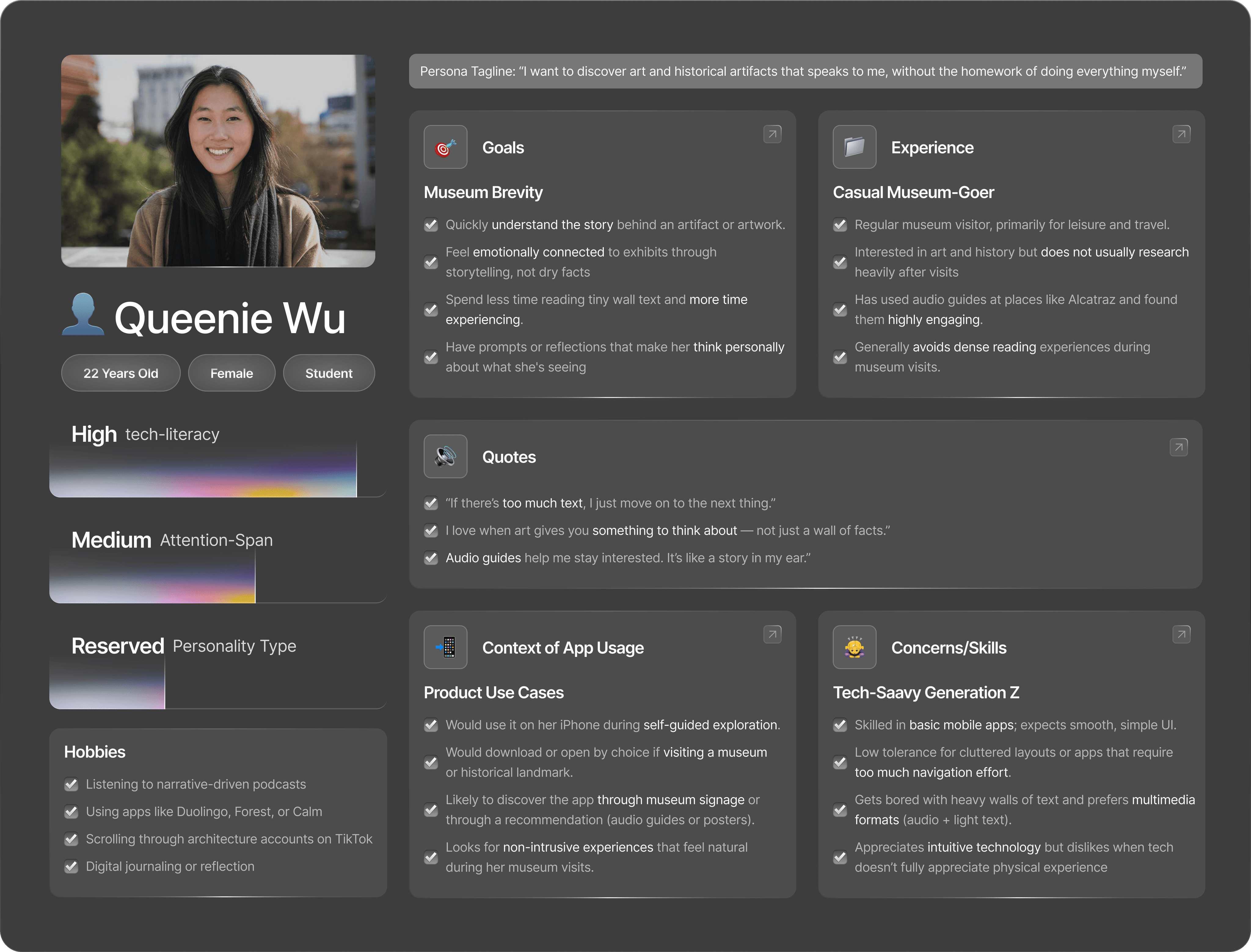
Putting a name and face to our user
From my research, I developed a primary persona: Queenie Wu, a curious and design-conscious student who wants cultural experiences to feel both rich and accessible.
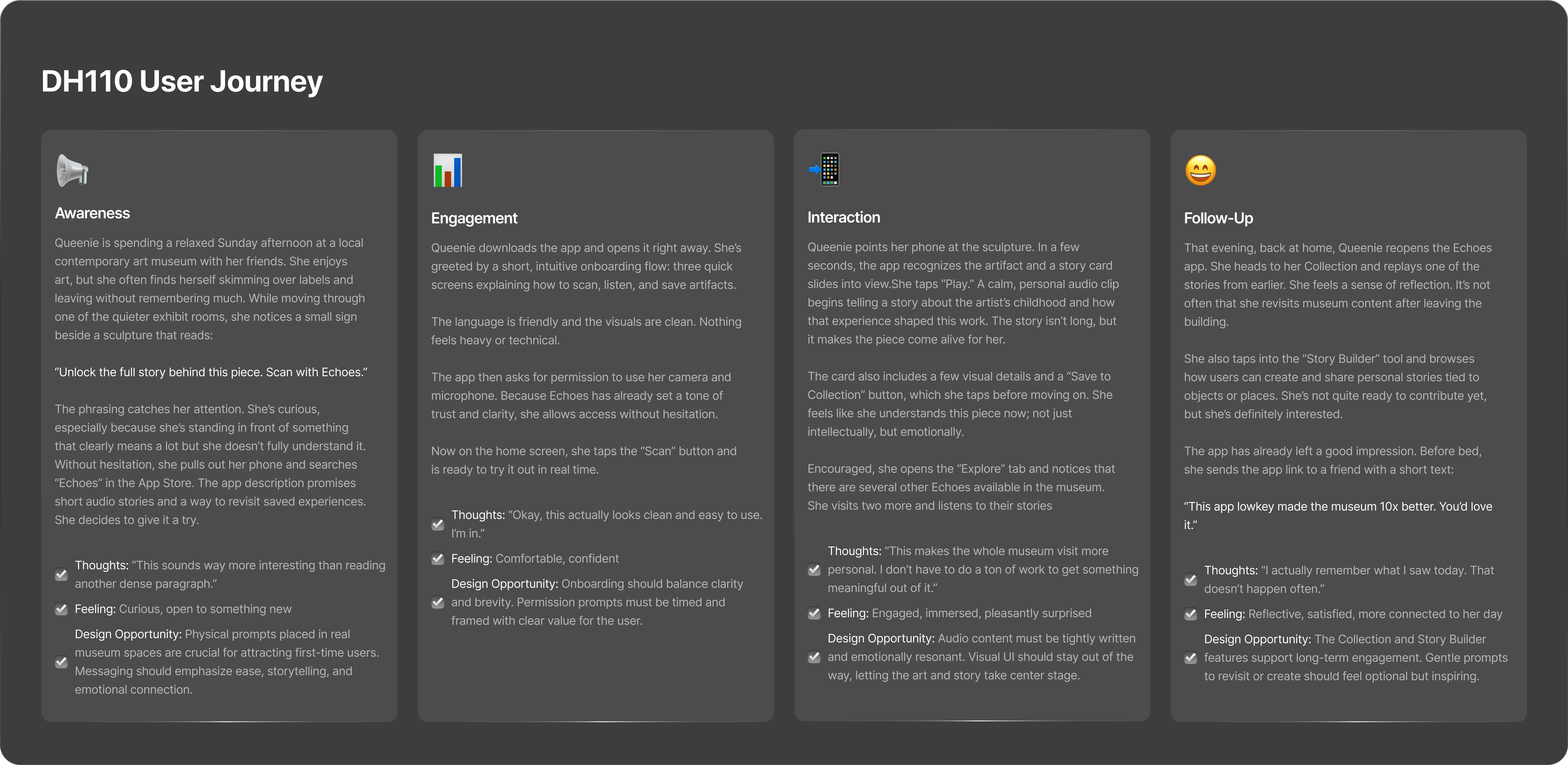
Her user need statement guided the project’s focus: “Queenie needs an app that reveals the stories and context behind artworks in a way that feels intuitive and invites her to engage further, because she wants museum visits to be memorable and personal, not passive.” I mapped out Queenie’s user journey from discovering Echoes to exploring artifacts on-site. Her journey includes onboarding, scanning a piece, listening to a short audio story, and diving deeper with contextual visuals and written details.
III. INFORMATION ARCHITECTURE
Pinpointing the cognitive load of the user
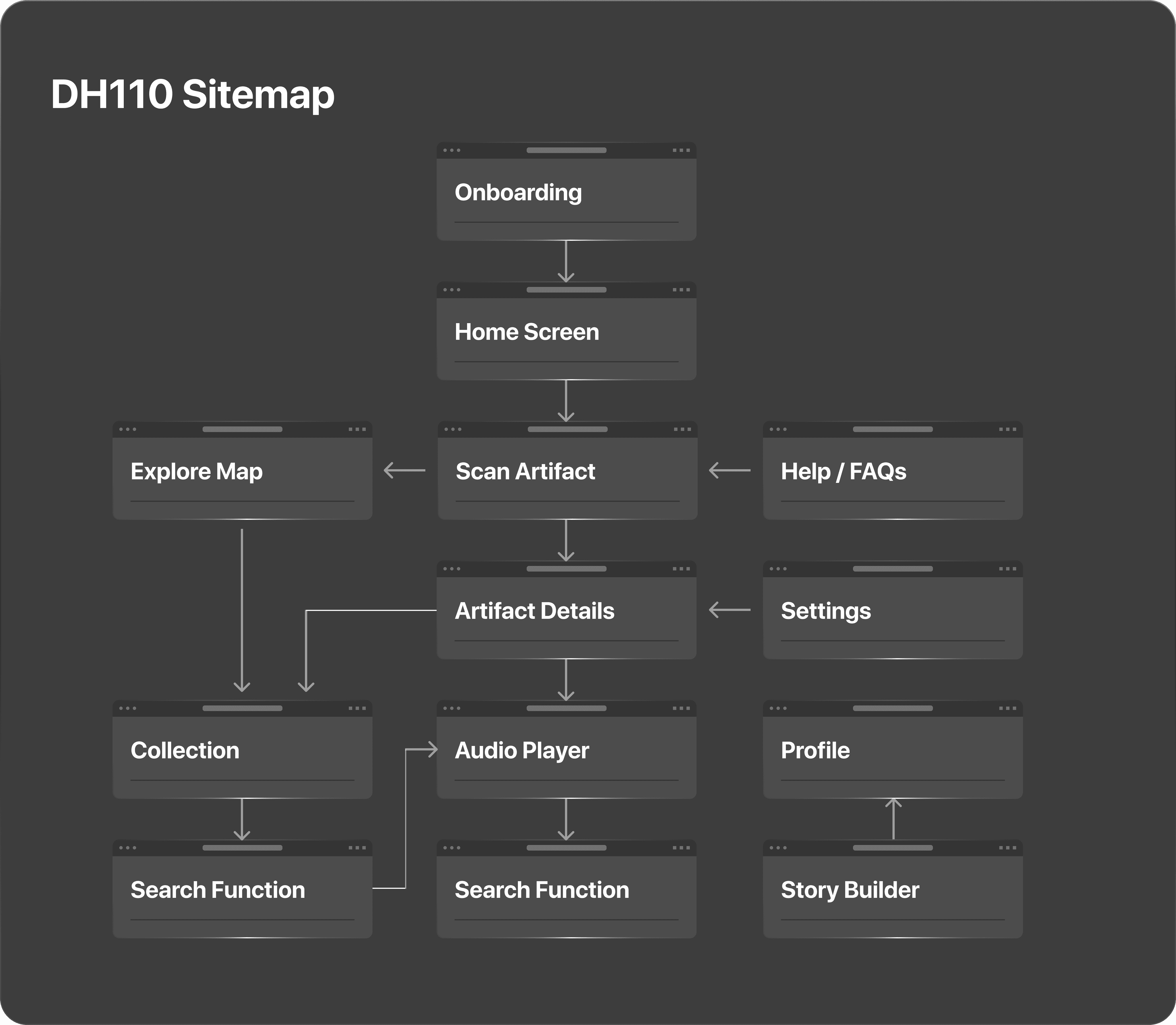
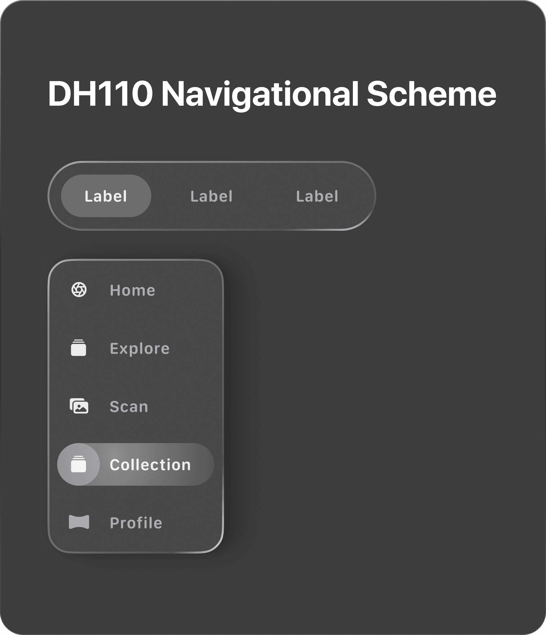
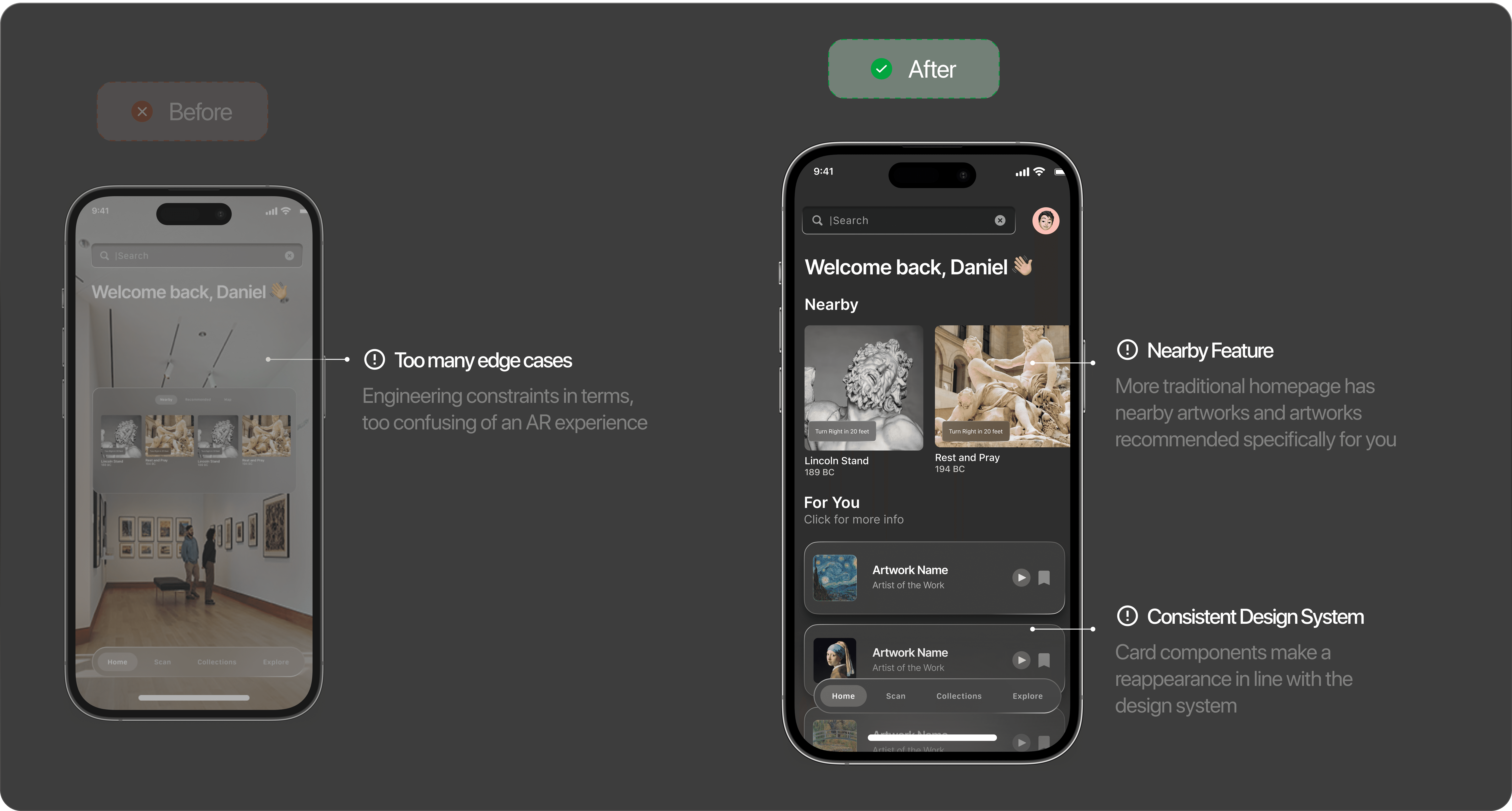
I structured the app’s sitemap to flow naturally from home discovery (nearby and recommended content) to deeper experiences: scanning objects, listening to stories, and saving personal collections. The navigation scheme was built around a bottom navigation bar with direct access to Home, Scan, Collections, and Explore—simplifying the experience while keeping essential functions one tap away.
IV. USER FLOW
Taking all the features and seeing how they interact with one another
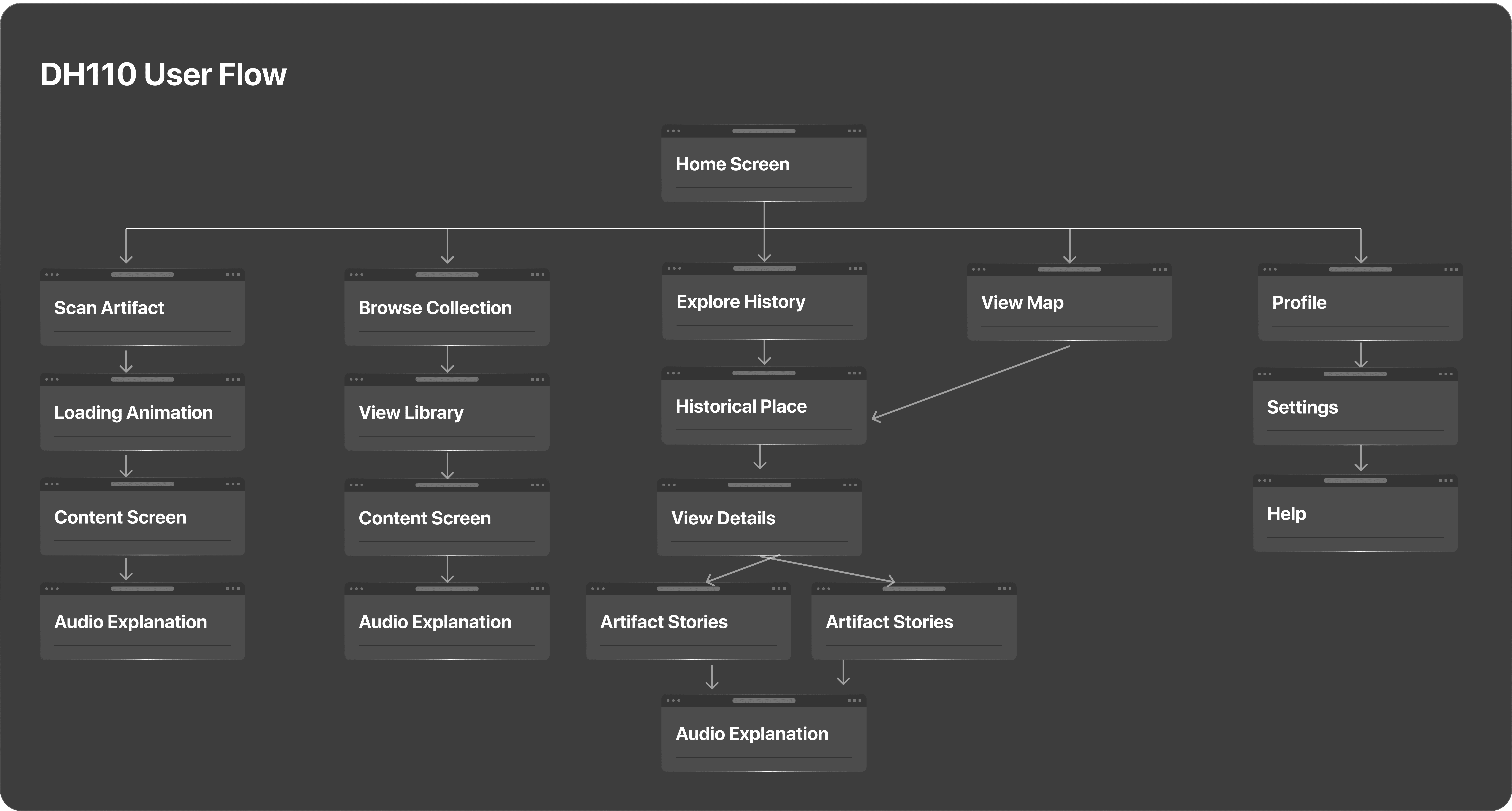
My user flow visually captured how each feature connected—highlighting the simplicity of navigating from scanning to storytelling, with seamless transitions designed to keep the focus on the artifacts themselves.
V. WIREFRAMING
Diving into figma and putting pen to paper
The first wireframes prioritized clarity and hierarchy. As I moved to high-fidelity designs, I leaned into a dark, neutral color palette that allowed artifacts to shine. The interface featured large imagery, subtle overlays, and clear typography—creating an almost cinematic effect. I also integrated micro-interactions to reinforce interactivity, like clear affordances for expanding cards and navigating audio experiences.
VI. COLOR PALETTE
Going simple and chique with the color choices
Echoes’ color palette is built around deep blacks, soft whites, and muted greys—creating an elegant, low-distraction backdrop for vibrant artwork and AR overlays. This palette evolved from my initial sketches, influenced by the feedback that users wanted clarity and warmth in the interface.
VII. USABILITY TESTING
Understanding user behaviors and patterns
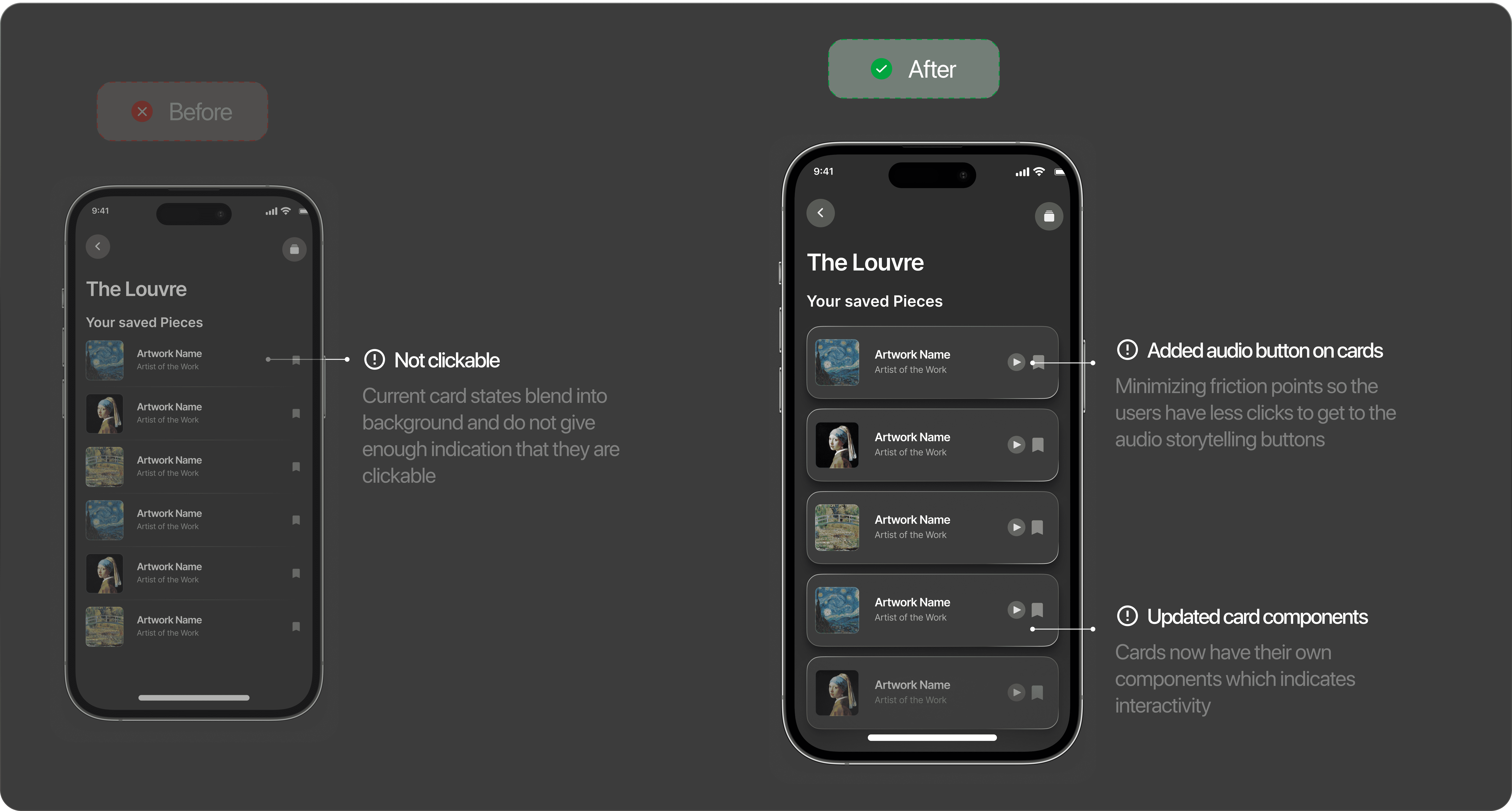
Usability testing surfaced a few critical challenges: the lack of clear affordances on scanned artifact cards, ambiguous map hotspots, and too much friction in accessing audio content. In response, I added clearer icons, hover effects, and more distinct labels. For instance, I introduced a dedicated audio play button in list views to reduce touchpoints and improve flow. This iterative process strengthened the final design by grounding it in real user expectations.
VII. REFLECTIONS
Taking the time to reflect on the quarter
What worked best was the overall visual system and the sense of calm and focus in the interface. Users consistently noted that the flows felt intuitive and that the design’s minimalism supported, rather than distracted from, the artwork. The biggest learning curve for me was balancing visual elegance with clear interaction cues—especially in a setting like a museum, where visitors might only glance at their phone for a moment.
The project was shaped by the constraints of working solo in a class context, without engineering support or real museum partners. In a future iteration, I’d love to explore deeper integrations with museum databases and more nuanced personalization of content based on visitor preferences and movement in the space.
Ultimately, Echoes was a chance to practice blending human-centered research with visual storytelling and AR technology—areas I want to continue exploring in my design career. I’m especially interested in pushing the boundaries of spatial interaction and accessibility in cultural spaces, creating digital experiences that feel timeless and rooted in human curiosity.

